Salesforce Aura Framework: How To Work With Aura Documentation Framework
Looking for Salesforce Training & HandsOn Projects?
Trailblazer Profile | LinkedIn | Salesforce Blog | Facebook | Youtube Channel | WhatsApp Community
Documenting
development artifacts are as critical as writing code for them and this fact
holds well no matter in which technology stack you are dealing with.
Salesforce
also is no exception to this. In this article, we will discuss and see the
implementations of the Aura Documentation Framework, which is a well-managed
approach recommended by Salesforce to document the functionalities &
behavior of Aura Components, Apps, Attributes and much more.
Aura
Documentation Framework is hugely dependent on the inline description
capabilities of lightning tags.
Few of them
are ”<aura:application>”
,“<aura:component>”,
“<aura:attribute>”,”<aura:event>”,“<aura:interface>”,”<aura:registerEvent>”.
To start
with the demo I have a simple component that I have developed earlier. I am
going to use this component and walk you through all the steps.
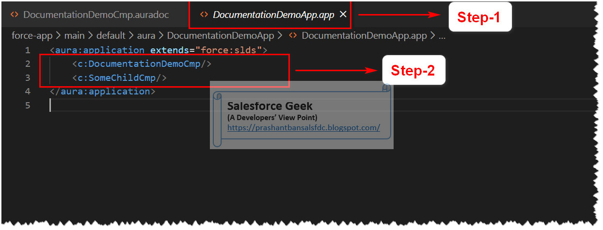
Step-1: We have an Aura Application which is
hosting two child components
Step-3: We can see the definition of “DocumentationDemoCmp” components
Step-4: We can see the HTML used to render this component
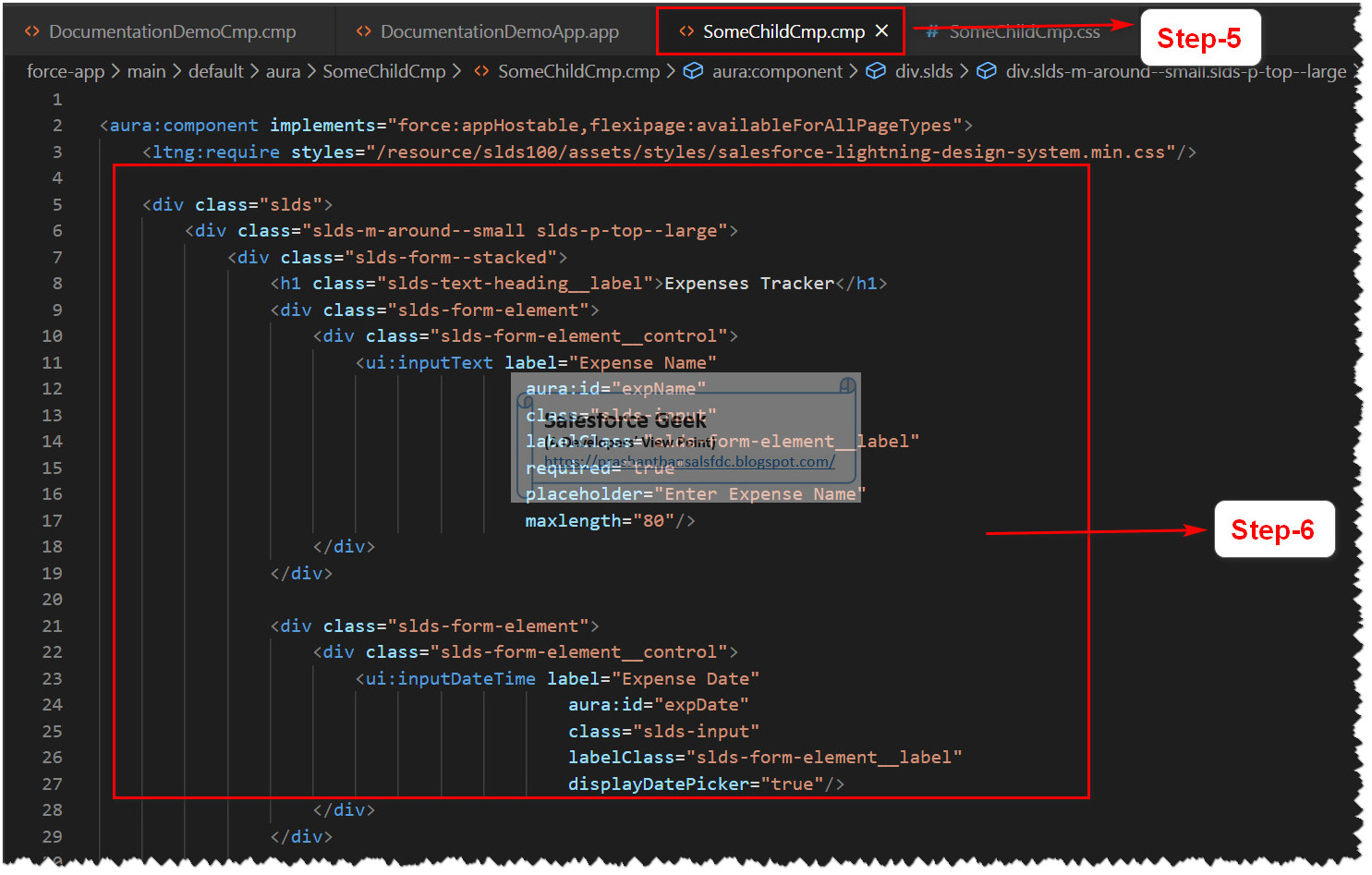
Step-5: We can see the definition of “SomeChildCmp” components
Step-7: The remaining part of HTML for this
component
Step-8: And finally we can see the complete
component rendered in the browser
Step-9: We can see the URL to navigate to
the documentation of all of your components
“<Salesforce Instance
Header>/auradocs/reference.app”
In this
demo, we have this URL translated to
“https://bansal-blogs-dev-ed.lightning.force.com”
Step-10: Under the “Component -> Aura -> <Default Namespace for Org> Link on
the left”, we can see Components listed
Step-11: Lets’ start investigating “DocumentationDemoCmp”
Step-12: We can see the details of all
components (Ex. “aura:component”
that act as the base for this components, also a list of Interfaces (Ex. “flexipage:availableForAllPageTypes”)
that are implemented in this component
Step-13: We can see the list of tabs each
corresponding file included in the Component’s Bundle. For example, the source
tab will display the content of the “.cmp”
file from Bundle and so on.
Step-14: We can see the Overview Tab, it
contains the information that is helpful to understand the functionality
component. Right now it is just showing default values. As we progress further
we will keep updating each of these sections
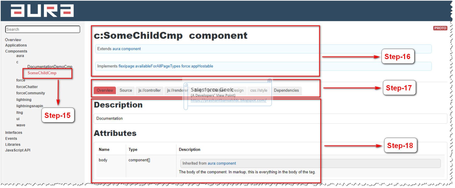
Step-15,16,17,18: In these steps, we can see the same
information for another Child Component “SomeChildCmp”
Step-19: Now we will start making some
changes to the Aura Component Documentation for “DocumentationDemoCmp” Markup. We need to modify “DocumentationDemoCmp.auradoc” file
that will automatically reflect the changes in documentation
Step-20: Add a description for the Aura
Component that will help Component Users/Consumers to understand the purpose of
the Component. Also can mention the usage details for the Component to let
users know how they can refer this component into their code
Step-22: Now if we go back to Aura
Documentation we can see our changes reflected into the documentations as
highlighted
Step-23: Now we will make changes to “DocumentationDemoCmp.cmp” file and add
“Description” property of the
attribute “title” declared within
the markup of the Aura Component, the description provided for this attribute
will be available as part of the documentation
Step-24: We can see the information listed
under the “title” attribute in Aura
Documentation. It is the same information that we have specified for “Description” attribute for the Aura
Component
Step-25: We can explore more of the tabs
listed under Aura Documentation. For example, under “Source” we can see the
source code for the Aura Component
Step-26: We can see the source code with all
the markup in “.cmp” from the
Component Bundle
Step-27: Under dependencies tab, we can all
the dependent Components, Interfaces, Styles and Types associated with the Aura
Component
Step-28: For example, this component is
making use of “ltng:require” which
is a standard component included inside this Aura Component
Step-29: Another example could be “flexipage:availableForAllPageTypes”
interfaces that have been implemented in this Aura Component
Step-33: Similarly we can define a relevant
description for Child Aura Component as well
Step-34: Similarly we can find the
description listed under Aura Documentation for the Component
Step-35: Likewise we can define the
description for the attributes declared inside the markup of the Child
Component
Step-36: And sure enough we will get the
description for the attribute added to the Aura Documentation
Step-37: We can keep adding information about
the component in the “.auradoc” file
of the Component Bundle for this child component
Step-38: We can also showcase the usage of
the component along with any attributes that are required to be passed
Step-39: We can view the effect of changes in
the Aura Documentation by visiting the “Overview”
tab
Step-40: Under the “Overview” tab we can see a new description is now added to the
documentation
Similarly,
we can see the source code for this component under different tabs available in
the Aura Documentation.
Step-42: For example on the “Source” tab we can see the HTML markup
used for this component which is part of “.cmp”
file from the component bundle
Step-44: Another example could be “css://style” tab where we can see the
custom CSS code used for this component
Step-45: We can see the completes CSS code is
used to style the HTML markup for this component
So far we
have discussed the steps to apply documentation settings for the Child
Components. In the steps below we will look for the steps of documenting a
Standalone Salesforce App which is hosting child components.
For this
demo, the app will be hosting the two-child components that we discussed above
till Step-45
Process of
documenting an App is similar to that of Components
Step-46: Let’s visit the Application with “.app” extension from the Application
Bundle as shown in the screenshot below
Step-47: Then we will add a description for
the App. This is exactly same as we did with documenting Component
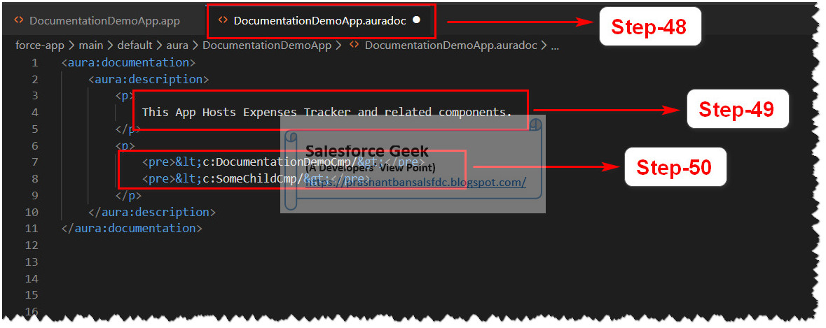
Step-48: Now lets’ visit to the “.auradoc” file from Application Bundle
Step-49: Add the description to the Aura
Documentation for the Application
Step-50: Add the details of the components
this App is hosting
Let’s visit
the Aura Documentation to see the effects of the changes we made in earlier
steps
Step-51: We can see a description is added to
the Aura Documentation for this App
Step-53: Like before we can see the source
code for this Application under “Source”
tab
Step-54: We can see the complete HTML markup
under the “Source” tab
Few more points
to notice-
Step-55: We can see the documentation of the
App by clicking the respective link from the tree view on the left
Step-56: We can find the list of all the
dependencies used within this Application under the “Dependencies” tab
Step-57: We can see this Application extends “force:slds” to include lightning
design system to beautify the HTML markup for the Application & all of its
child components
Step-58: We can see the list of Components
which this application is holding as its child
Step-59: We can also see the list of CSS
styles (Custom CSS for the application) included within this app
I found this
feature of documenting all of your Aura Components so cool, it is fairly easy
to implement and impressive way to showcase your components to your clients, or
if it is part of the managed package then to all consumers of your components.
Hope you
enjoyed this article. Please leave your comments to let me know how you do like
the content and how you do find it helpful to learn the topic.
Trailblazer Profile | LinkedIn | Salesforce Blog | Facebook | Youtube Channel | WhatsApp Community


Comments
Post a Comment